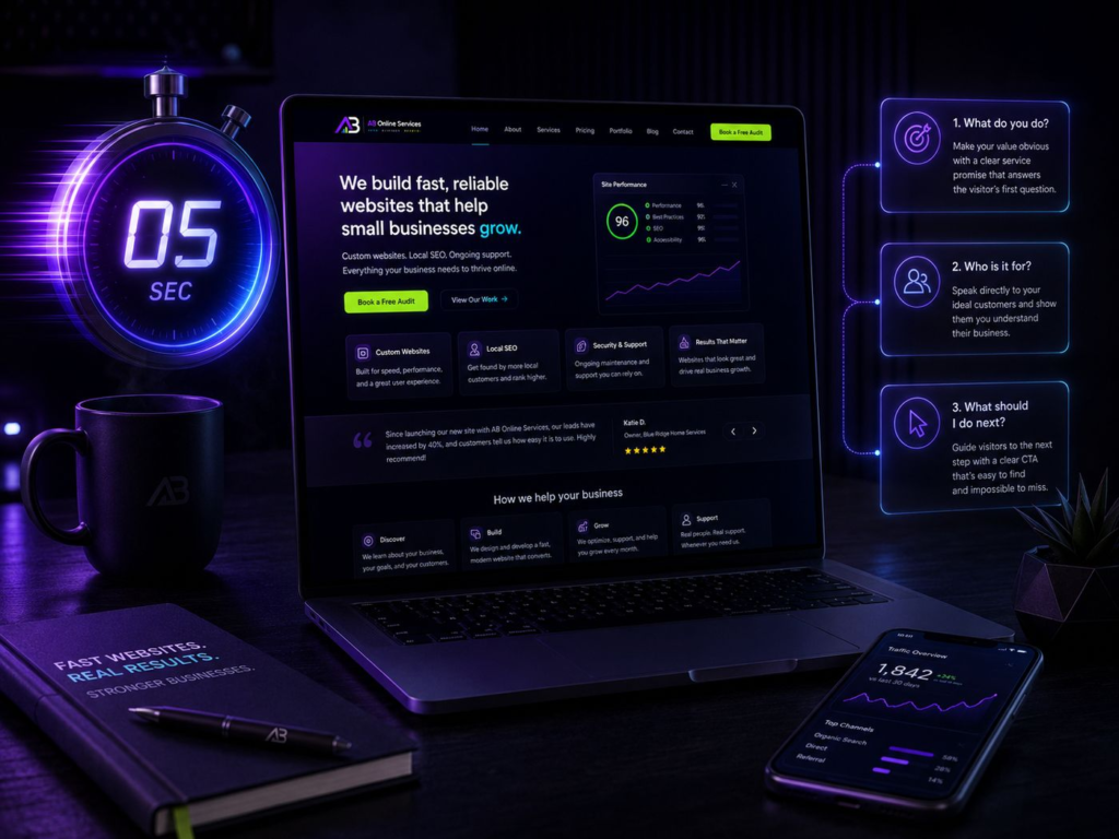
When someone lands on your website, they are not reading. They are scanning — deciding whether this business is relevant to them before they commit any real attention. I design every homepage as if I have five seconds to earn the next thirty.
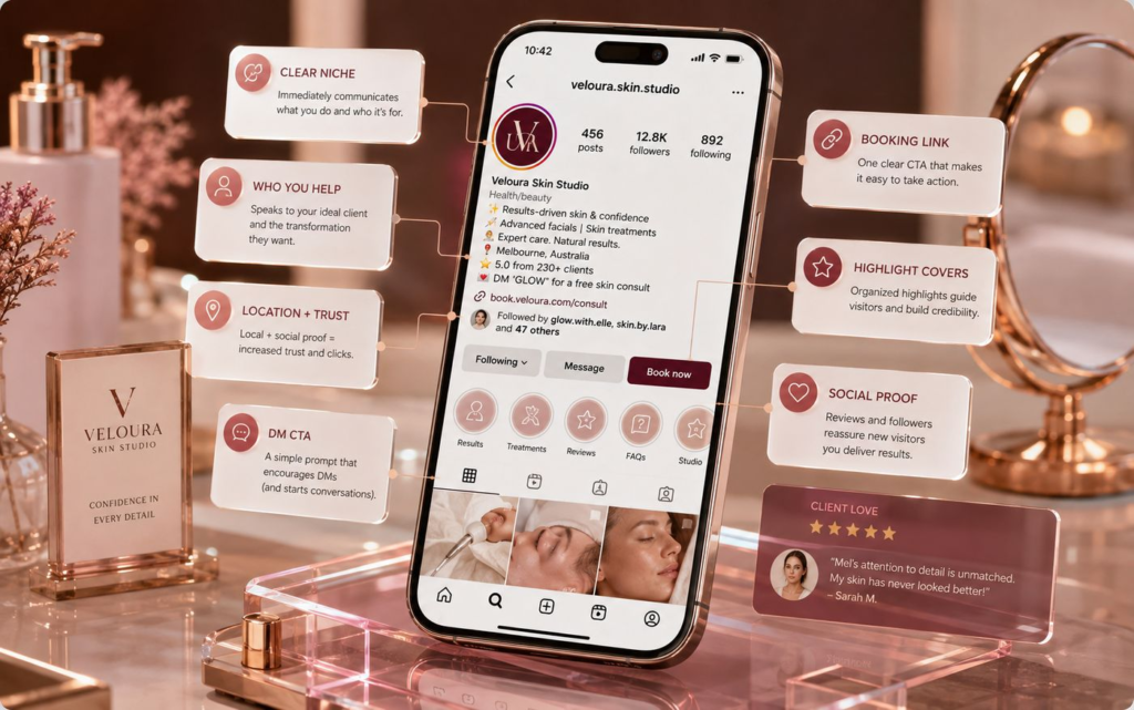
That means the top of the page has one job: orientation. Not history, not awards, not a slideshow of stock photography. Three questions, answered plainly, before a visitor has to scroll or think.
The three questions
Every homepage I build answers these in order, in the first screen on a phone. If a visitor can’t answer all three from what they can see, the page isn’t finished.
1. What do you actually do?
Say it in the words your customers use. A salon is a salon — not a “beauty destination”. A plumber fixes leaks and installs boilers. Clever headlines that need a second read cost you the visitors who were never going to give you one.
The test is simple: cover your logo and read the headline out loud. If it could belong to a marketing agency, a gym and a law firm at the same time, it’s too vague to be useful.
2. Who is it for, and where?
Local businesses win on relevance, not scale. Naming the area and the type of customer does more for you than any adjective — it tells the right person they’re in the right place, and it quietly tells search engines the same thing.
3. What happens next?
One obvious next step, visible without scrolling, repeated down the page. For most local businesses the fastest path is a message rather than a form: WhatsApp, a phone number, or a booking link — whatever the customer is already comfortable using.
The things I check on every build:
- The headline names the service and the place it’s offered.
- The primary action is one tap away on a phone, and looks like a button.
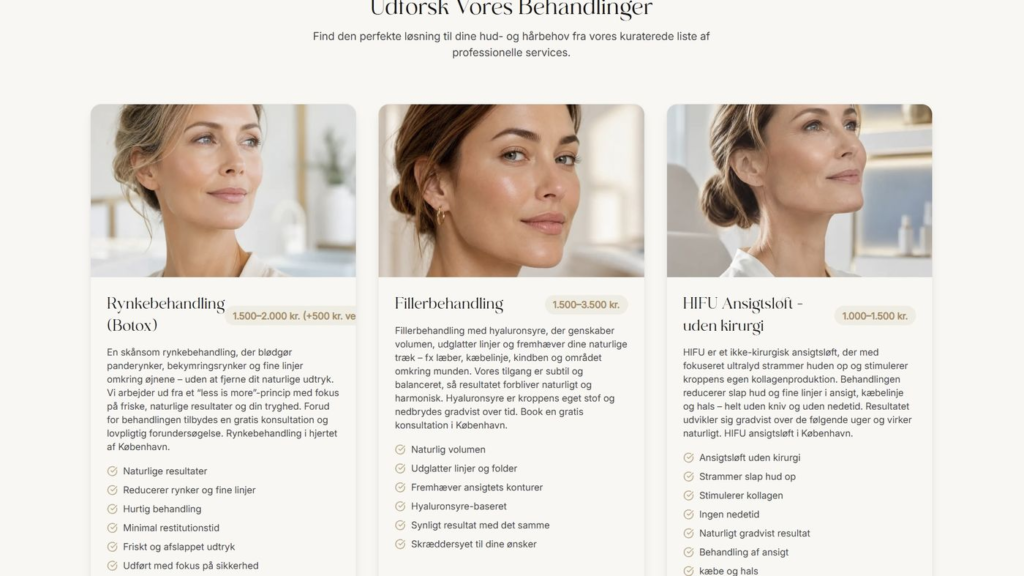
- Prices, or at least a starting point, are somewhere on the site.
- Opening hours and location are readable without pinching or zooming.
- Nothing above the fold moves, autoplays or needs to be dismissed.
Clarity is the cheapest conversion tool you have. It costs nothing to add and there’s no version of your business it doesn’t help.
Something I repeat in every kickoff call
Your homepage is not a brochure — it’s a routing decision. Tell visitors what you do, who it’s for, and the one thing to do next. Everything else on the page is supporting evidence.
How to check your own homepage in ten minutes
Do this on your phone, not your laptop, and preferably on mobile data rather than your shop’s wifi. You want the experience a first-time visitor gets.
- Open your homepage and don’t scroll. Screenshot it.
- Show the screenshot to someone who doesn’t know your business and ask them what you do and who you do it for.
- Ask them what they’d tap to book. If they hesitate, your call to action isn’t doing its job.
- Now scroll once. Note the first moment you have to guess where something is.
- Write down the three things that confused them. That’s your fix list, in priority order.
This is deliberately low-tech. You don’t need analytics to find the biggest problems on a small business homepage — you need one honest outsider and five minutes of their time.
What to fix first
Fix the headline before you touch the design. A rewritten first sentence changes how the whole page reads, and it costs you an afternoon rather than a rebuild. After that, in order: make the primary action obvious, cut anything above the fold that isn’t answering one of the three questions, and only then worry about photography and polish.
When a redesign is the right answer
Sometimes the copy isn’t the problem — the structure is. If your site is slow on a phone, if it was built for desktop and squeezed down, or if adding a booking button means fighting the theme, you’ll spend more time patching it than replacing it. That’s the point where a rebuild is cheaper than maintenance.
If you’d rather not judge that yourself, that’s the sort of thing I look at in a free growth audit — including whether your current site is worth keeping.
What not to do
Don’t add more. The instinct when a website isn’t working is to bolt on another section, another badge, another pop-up. Almost every homepage I open would perform better with a third of it removed and the remaining two thirds said more clearly.
Start with the three questions. Answer them like you’d answer a customer standing in front of you — and let the rest of the page earn its place.